
I’m a Product Experience Designer with a passion for creating simple, effective, human-centric solutions
Scotland | UK Remote
Pixels with Purpose

Refresh of Ripple Dashboard

Ripple Energy
Sole designer in a 3 person product team
Overview
Ripple Dashboard is a platform that provides members with a clear and interactive view of their renewable energy ownership. Members can monitor their wind farm share performance, track energy generation, and view monthly savings. They can also make additional purchases and manage account info here.
I refreshed the Ripple Dashboard across Desktop and Mobile from concept to final design to better align with new business goals and evolving user needs.
Outcome & Impact
A robust and future-proof platform - Seamlessly integrates upcoming feature sets, accommodating new projects as they begin to generate, ensuring long-term scalability and adaptability.
Enhanced information architecture (IA) - Through improved nested page structures, resulting in better grouping of features and significantly improved discoverability for users.
An optimized mobile experience - Delivering an app-like interface that feels intuitive and familiar, catering to the growing number of users accessing the platform via mobile as their projects come online.
A cohesive and efficient design system - Established through the creation of the Ripple Dashboard UI Kit. This set of components and styles ensures a consistent look, feel, and functionality across the platform. It also accelerates the design and development of future features, as the prebuilt components streamline the process.
Case study coming soon, Figma design file is available for review upon request
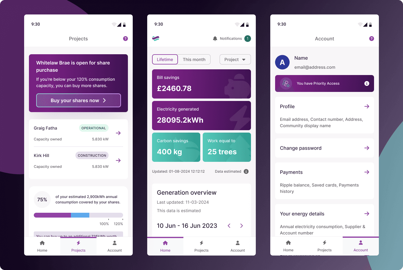


Introducing a Dynamic New Range of Data Visualisation Capabilities
Ripple Energy
Sole designer in a 3 person product team
Overview
Once a Wind Farm becomes operational and starts generating green electricity, Ripple Energy begins to receive data from the turbine manufacturer via an API containing various metrics on performance and production.
I introduced a dynamic new range of visual data capabilities to the Ripple Dashboard based on the data received through the API to excite and engage the members and make their share/investment in the project feel more tangible.
Outcome & Impact
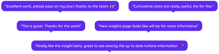
Community-Driven Innovation - Members actively shared their positive experiences and offered constructive suggestions for further enhancing data visualisation features through the community forum.
Accessible Data Visualisations - Users seamlessly interact with data through charts and visual features that employ clear colour contrasts and layouts, ensuring the content is accessible to all.
Harmonised User Experience - Across the platform, members benefit from a familiar and intuitive structure to data visualisation components that minimises the learning curve and boosts confidence in navigation.
Sustainable Visual Standards - Future development is streamlined by a robust internal framework that guarantees every new data visualisation component remains accessible, consistent, and on-brand as the platform evolves.


Case study coming soon, Figma design file is available for review upon request

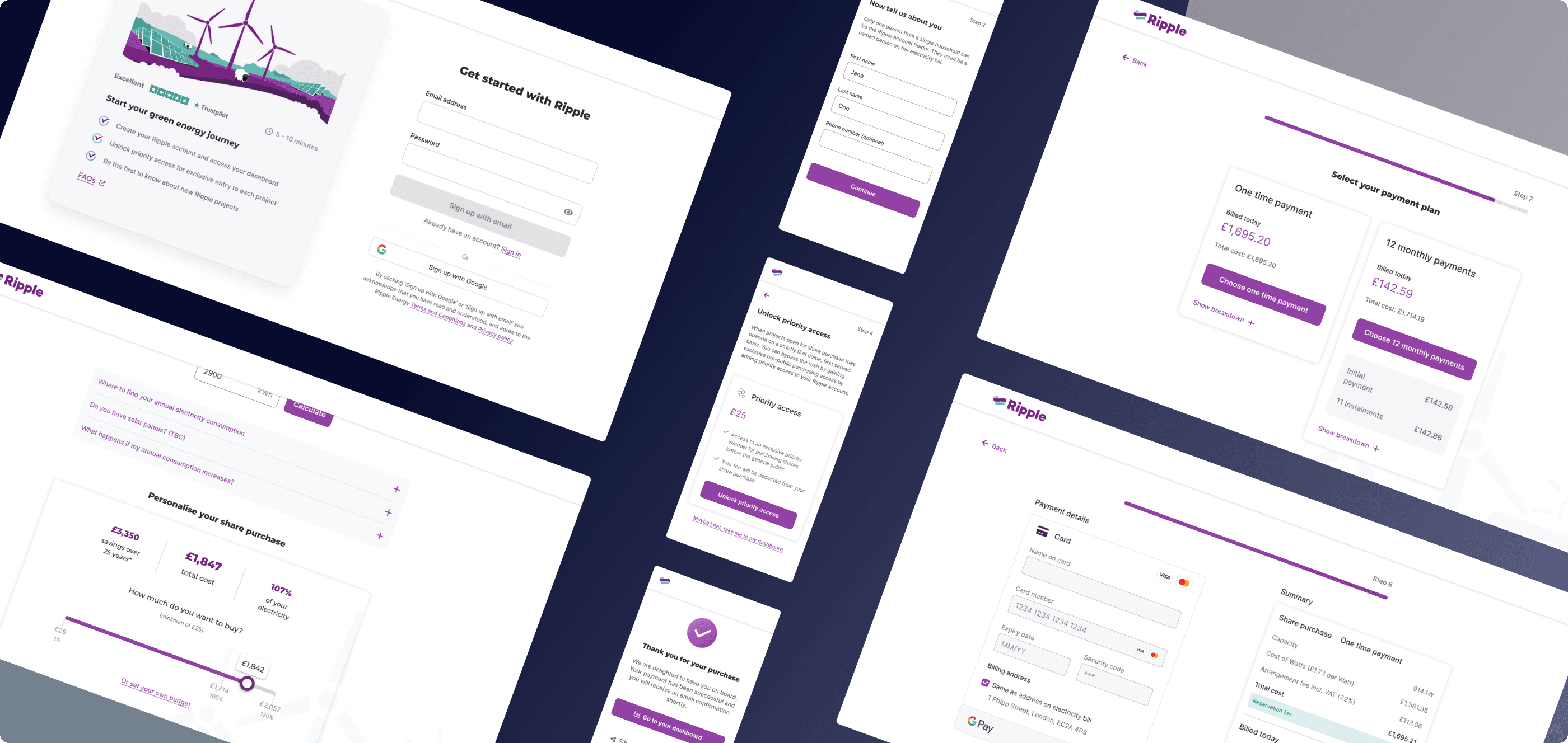
Reimagining the Wind Farm Share Purchase Journey
Ripple Energy
Sole designer in a 3 person product team
Overview
Ripple Energy gives consumers the opportunity to purchase a share in a wind farm or solar park and subsequently receive a saving on their electricity bill for the operational lifespan of the renewable project, typically 25 - 35 years. This is facilitated by a purchase journey on the website where users sign up, choose how much they want to invest and make payment. Through analytics and research we discovered users were dropping off at a variety of stages in the flow.
I planned and led further research and analysis to determine the core issues with the journey and subsequently spearheaded it’s full redesign to tackle and improve on all friction points.
Outcome & Impact
+25%
Improvement in Conversion Rate
-50%
Reduction in Journey Completion Time
Reduced Cognitive Load - By chunking input forms and adopting progressive disclosure techniques, users can complete steps without feeling overwhelmed by a wall of information.
Enhanced User Experience and Usability - A smoother, more intuitive experience for users. This led to higher user satisfaction as customers can easily navigate choices and inputs and complete payment with confidence. This also adds to a stronger brand perception.
Improved Analytics and Data Insights - Integrated better analytics throughout the journey to pinpoint any future areas where users may struggle. This empowers continuous improvement in future iterations.
An Accessible and Inclusive Experience - A focus on accessibility ensures that all users can navigate the journey with ease.
Case study coming soon, Figma design file is available for review upon request


Strategic Redesign of Website Home Page
Ripple Energy
Sole designer in a 3 person product team
Overview
Users form an impression of a new product or company quickly so it is important to ensure that a home page is clear and engaging, answers all the main questions about the product, and builds brand credibility. Based on research we found that the existing Ripple Energy home page was not performing well and users were dropping off.
As part of an internal initiative, I revamped the design and information architecture of the home page to create a more engaging, cohesive and intuitive user journey.
Outcome & Impact
A Compelling First Impression - The updated home page immediately communicates Ripple’s identity, functionality, target audience, and benefits, building strong brand credibility from the first visit.
Elevated Visual Cohesion - The refined visual styling adopts a softer approach, integrating branded assets and colour schemes that create a welcoming, consistent, and engaging interface.
Mobile-Optimised Experience - Users can navigate the home page effortlessly on mobile, enjoying an intuitive and fully accessible experience.
Case study coming soon, Figma design file is available for review upon request
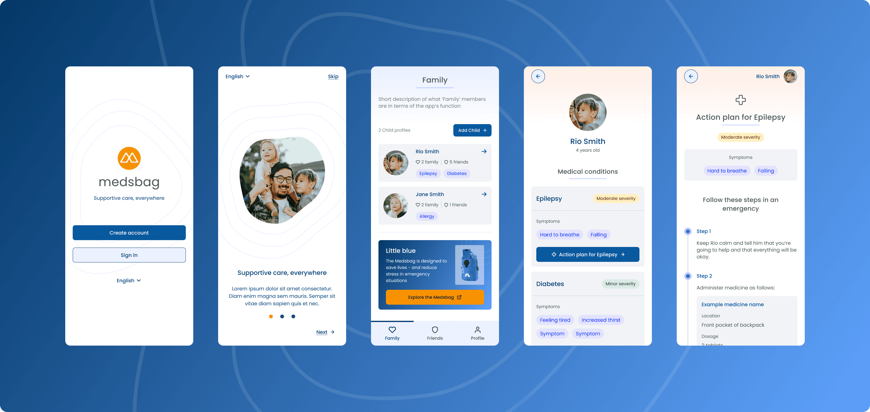
Digitising Health: A Usability Audit and Redesign

Medsbag
Volunteer designer
Volunteer position
Overview
As a volunteer UX Designer for Medsbag through 'We Make Change', I had the opportunity to dive into an early preview of their innovative health app that allows parents and carers to create digitised action plans for children with unique medical circumstances.
I evaluated the pre-release version and crafted a comprehensive feedback document that pinpointed opportunities for usability enhancements. I then translated my insights into vibrant concept designs, reimagining flows, refining features and reworking layouts to elevate the overall user experience.
Outcome & Impact
Comprehensive Usability Insights - Produced an in-depth audit report that identified key pain points and opportunities, forming a clear, actionable roadmap for design improvements.
Streamlined User Flows - Reimagined and optimised flows, enabling parents and carers to easily create and manage digitised action plans. These refined flows aim to reduce friction and increase clarity.
Elevated Visual Hierarchy and Layout - Crafted vibrant concept designs that improved the layout of core features, ensuring a consistent and reassuring experience for users.
Improved Usability and Accessibility - Focused on enhancing the usability of critical app functions, which helps users—potentially under stress due to urgent medical circumstances—engage more confidently with the app.


Clear up: Designing a Seamless Booking Experience for Home Junk Removal
Side Project
Sole designer
Work in progress
Overview
The current landscape of home junk removal services suffers from clunky, outdated booking procedures that often leave users juggling unclear pricing, limited scheduling options, and fragmented communication through phone calls, text and email. This project uncovers an exciting design opportunity to transform the experience - a space where the cumbersome phone calls and emails can be replaced with an intuitive, sleek, end-to-end app solution. By realigning the process around the user's needs and expectations, the goal is to create an engaging app experience that offers clarity and ease, streamlining everything from enquiry to confirmation, and ultimately making a traditionally frustrating task feel effortless.
Coming soon
Professional Praise
Proudly trained and certified by the UX Design Institute

Professional Certificate in UI Design


Meet Anthony
Hi there! 👋 I'm a Product Experience Designer who is passionate about creating intuitive, user-centric experiences that drive engagement and elevate digital products. Most recently, I've been designing enterprise SaaS products at DoiT International, shaping multi-tenant platforms, partner ecosystems and administrative workflows. Before this, I led the design strategy for Ripple Energy's member dashboard, website and purchase journeys, helping improve both customer experience and business outcomes.
Throughout my career, I have had the opportunity to work on a diverse range of digital products in FinOps, Energy, Health Tech and Human Capital Management. This has allowed me to develop a deep understanding of the design process and product and strategic thinking.
My design journey began with achieving the Professional Diploma in UX Design from the UX Design Institute in 2021, which solidified my design thinking foundations and taught me how to seamlessly bridge the gap between business objectives and user needs. This formative experience informs every project I undertake, grounding my creative process in strategic, and data-driven insights.
Beyond this my background includes professional experience in Software Development and Data Analysis, equipping me with a broad range of technical skills and understanding. These technical proficiencies complement my design work by enabling me to bridge technical and design/product domains effectively.